Bar Charts
Bar Charts Revision
Bar Charts
A bar chart is a visual representation of data using rectangular bars to compare different categories. Each bar’s height or length corresponds to the value it represents, making it easy to see patterns, trends, and differences at a glance. Bar charts are commonly used in business, statistics, and everyday data analysis to display information clearly. They can be drawn horizontally or vertically and are especially useful for comparing discrete categories, such as survey results, sales figures, or population data.
Understanding Bar Charts
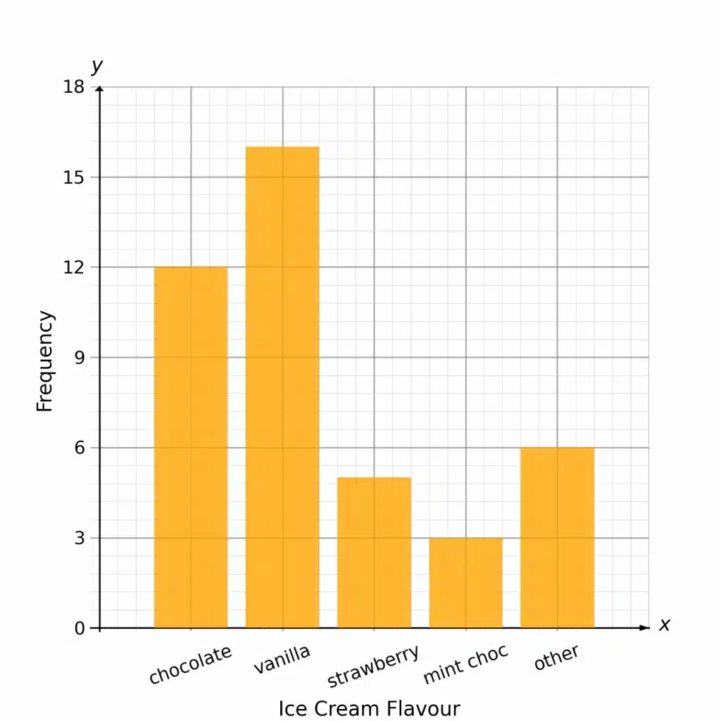
A survey was conducted asking people about their favourite flavour of ice cream. The results of this survey are displayed on the bar chart
Example:
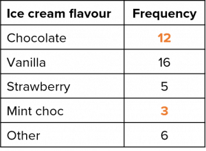
a) Use the bar chart to fill in the gaps in the table.
To fill in the missing gaps in the table, we must read off the height of their corresponding bars from the bar chart.
We can see that each little square is worth 0.6, and so the height of the ‘chocolate’ bar is 12 and the height of the ‘mint choc chip’ bar is 3.
b) Calculate the percentage of people surveyed whose favourite flavour is strawberry.
From the table, we can clearly see that 5 people chose strawberry as their favourite. To find out what this is as a percentage, we need to work out how many people there were in total.
\text{Total }=12+16+5+3+6=42
Therefore, the percentage of people who chose strawberry is
\dfrac{5}{42}\times 100=11.9\%\text{ (1 dp)}
Comparing Data Using Bar Graphs
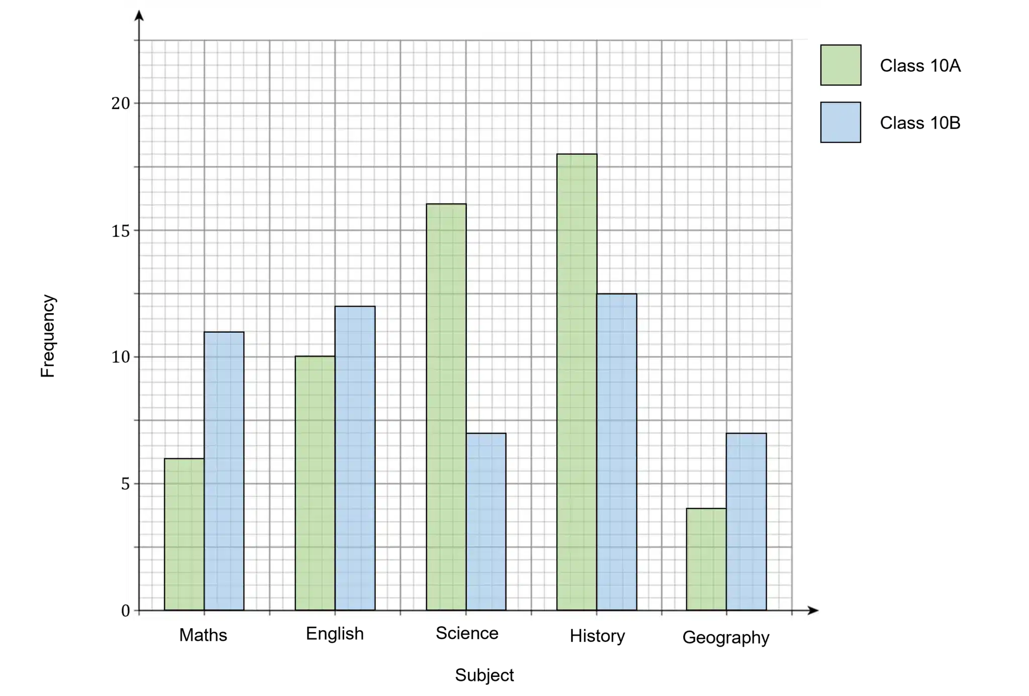
If we want to compare two sets of data within the same context we can either plot both bar charts on the same graph or plot a composite bar chart.
Side by Side
The following bar chart shows the favourite school subjects of pupils in class 10\text{A} and 10\text{B}.
We are then able to draw conclusions from the bar chart, e.g. English is more popular in class 10\text{B}.
Composite Bar Charts
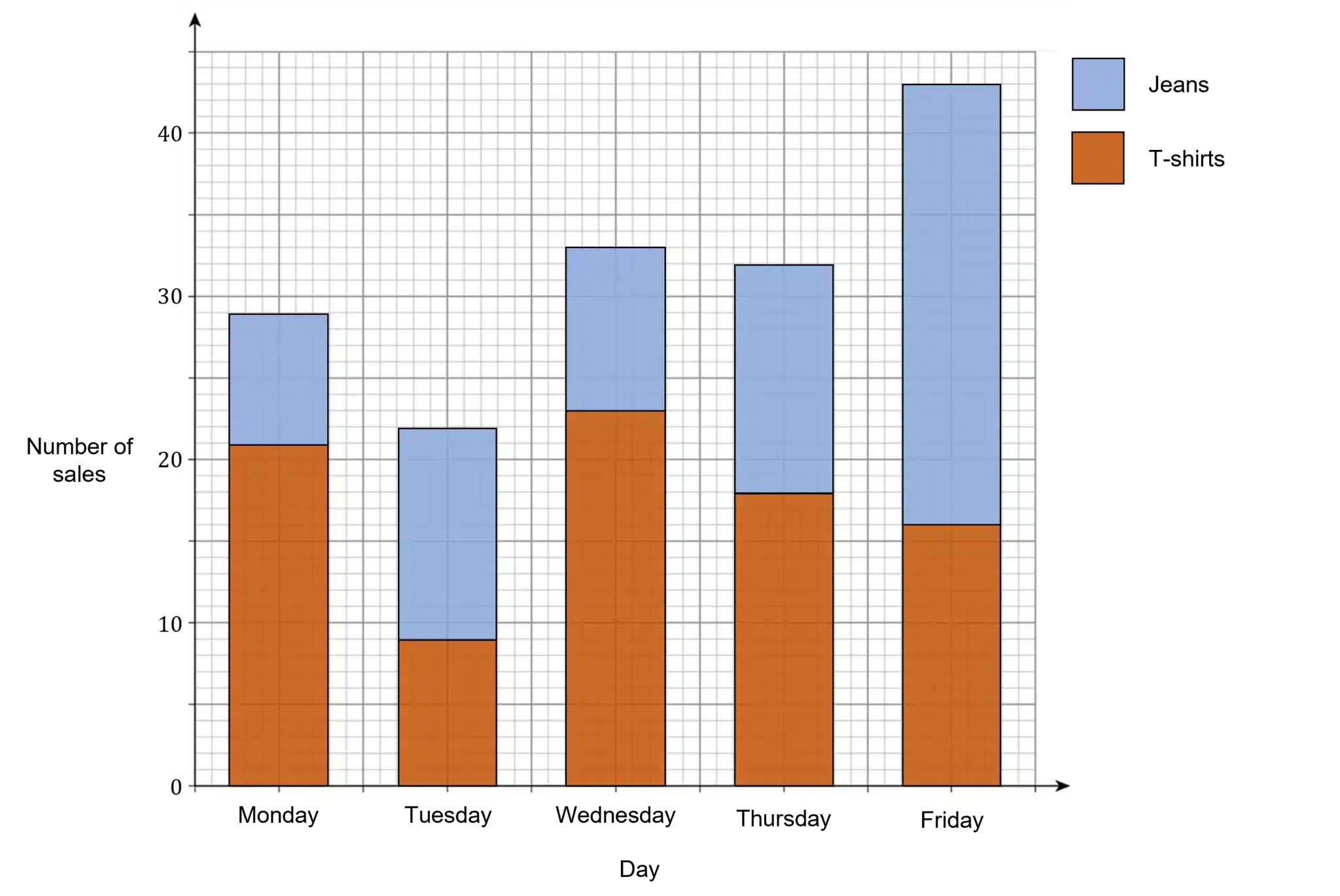
Composite bar charts are another way of displaying more than one data set within the same context. Instead of the bars being side by side, they are stacked on top of each other.
For example, the bar chart below shows the number of sales at a clothes shop per day for both jeans and t-shirts.
We can see that on Monday there were \textcolor{#10a6f3}{21} t-shirts sold and \textcolor{#10a6f3}{8} pairs of jeans sold.
Bar Charts Example Questions
Question 1: A bookstore sells three different kinds of books: paperbacks, hardbacks and audio-books. They record their sales of each type of book over the course of one year and display the results in the bar chart shown below:
a) What percentage of total book sales were audio-books?
b) Write the ratio of hardbacks sold to paperbacks sold in its simplest form.
a) According to the scale on the y-axis, 5 small squares accounts for 2,000 book sales, so:
\text{One small square }=2,000\div 5=400\text{ books}
So, that means the number of audiobooks sold is 3,000, the number of hardbacks sold is 5,000, and the number of paperbacks sold is 12,000. Therefore the percentage of sales that were audiobooks is:
\dfrac{3,000}{3,000+5,000+12,000}\times 100=15\%
b) We’ve already determined the number of hardbacks and paperbacks sold, so the ratio is:
5,000 : 12,000 = 5 : 12
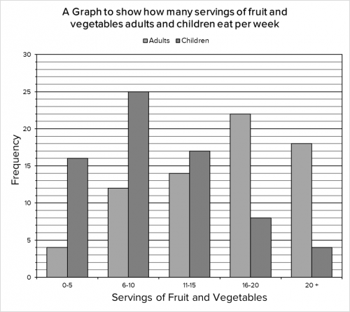
Question 2: 70 adults and 70 children were surveyed to find out how many servings of fruit and vegetables they eat per week. The results are shown in the bar graph below:
a) How many adults and children combined eat between 0 and 5 servings of fruit and vegetables per week?
b) What is the difference between the number of children who eat over 20 servings of fruit and vegetables per week and between 6 to 10 servings of fruit and vegetables per week?
c) What basic trend do we notice from the data presented?
a) For this question, we need to take a reading of the two bars showing the 0 – 5 servings per week category. The number of adults who have between 0 and 5 servings per week is a total of 4. The number of children who have between 0 and 5 servings per week is a total of 16.
Therefore, the number of adults and children combined who have between 0 and 5 servings is 4+16 = 20
b) For this question, we simply need to locate the bar that represents children eating over 20 servings and the bar that represents children eating between 6 – 10 servings, and work out the difference between them.
The number of children who eat over 20 servings of fruit and vegetables is 4. The number of children who eat between 6 and 10 servings of fruit and vegetables is 25. Therefore, the difference between these two categories is 25-4=21
c) The most basic trend we can obtain from the given information is that adults eat more portions of fruit and vegetables per week than children.
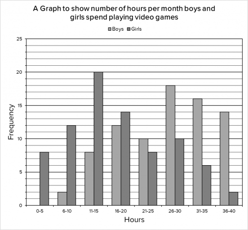
Question 3: A survey was conducted on the number of hours per month boys and girls spend playing video games. The results are shown in the bar graph below:
a) How many girls played video games for 6-10 hours?
b) How many boys played video games for less than 16 hours?
c) What percentage of the girls played video games for 10 hours or less?
a) For this question, we need to locate the bar that corresponds to girls and 6-10 hours and take a reading from the top of the bar. Doing so we find 12 girls played video games for 6-10 hours.
b) We need to be careful with this question as It is asking for less than 16 hours, so this means we need to consider all the data to the left of the 16-20 hours bar. The number of boys who played video games for 11-15 hours was 8 and the number of boys who played 6-10 hours was 2.
Therefore the number of boys who played for less than 16 hours was 8+2=10\text{ boys}.
c) For this question, we are looking for 10 hours or less for the girls. This means that we need to look at the first two bars. The number of girls who played for 6-10 hours was 12 and the number who played for 0-5 hours was 8. Therefore the number of girls who played video games for 10 hours or less was 12+8=20\text{ girls}.
This means that 20 out of the total number of girls played for 10 hours or less. However, we don’t know how many girls there were in total, so we will need to add up the totals for each bar. Doing so we find that in total there are 8+12+20+14+8+10+6+2=80\text{ girls}.
Thus 20 out of the 80 girls play video games for 10 hours or less, which works as 25%.


