Line Graphs
Line Graphs Revision
Line Graphs
A line graph is a type of chart used to display information that changes over time. It helps us identify trends, patterns, and fluctuations in data by connecting individual data points with straight lines.
Line graphs are commonly used in situations where we want to track progress, compare values over a period, or spot increases and decreases in a dataset. For example, a line graph can show how temperatures change over a week, sales figures fluctuate each month, or sleep patterns vary daily.
By analysing a line graph, we can quickly see whether something is increasing, decreasing, or staying the same, making it a powerful tool for understanding data at a glance.
Understanding Line Graphs
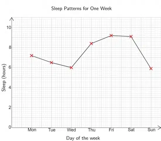
A line graph is useful for showing trends over time. In this case, David recorded the number of hours he slept each night for a week. His results are displayed in both a table and a line graph.


How to Read the Graph
Identify the Axes:
- The \boldsymbol{x}-axis represents the independent variable—in this case, the days of the week.
- The [\boldsymbol{y}-axis represents the dependent variable—the number of hours of sleep.
Look at the Data Points:
- Each ‘x’ on the graph marks the number of hours of sleep recorded for a specific day.
- The points are connected by straight lines to show how sleep duration changed over the week.
Observe Trends:
- The sleep duration starts at \boldsymbol{7.2} hours on Monday, then decreases midweek to a low of \boldsymbol{6} hours on Wednesday.
- Sleep increases significantly from Thursday, peaking at \boldsymbol{9.2} hours on Friday and staying high on Saturday.
- On Sunday, sleep drops to \boldsymbol{5.9} hours, the lowest point of the week.
Analyse Patterns:
- The graph shows that David tends to sleep less during weekdays but gets more sleep on Thursday, Friday, and Saturday.
- A sharp decline on Sunday suggests a return to shorter sleep before the new week begins.
- By examining the shape of the graph, we can see how David’s sleep patterns fluctuate, helping us identify possible reasons, such as school or work schedules, affecting his sleep during the week.
Line Graphs Example Questions
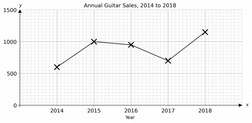
Question 1: Roger decided to draw a line graph to represent the data shown in the table below on the number of guitars sold by a music shop over the course of 5 years.
State two mistakes that Roger made in drawing his line graph.
The first mistake Roger made is that he didn’t label one of his axes.
The second mistake he made is that he plotted the 2014 point at 600 when it should be at 700.
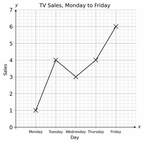
Question 2: What is the overall trend of TV Sales over the week?
Despite a dip from Tuesday to Wednesday, the overall trend is increasing throughout the week.
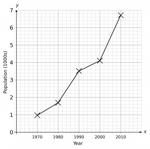
Question 3: Over the 5 observations recorded, what is the mean population?
We can read each observation’s value by going along to the y-axis from each ‘x’.
We can then find the mean by summing them and dividing by 5
Observations are: 1,1.7,3.5,4.1,6.7
Mean is therefore \dfrac{1+1.7+3.5+4.1+6.7}{5} = 3.4


