Pie Charts
Pie Charts Revision
Pie Charts
A pie chart is a circular diagram used to represent data as proportional segments of a whole. Each slice of the chart corresponds to a category, with its size determined by the percentage it contributes to the total. Pie charts are useful for showing relative proportions, making them ideal for visualising survey results, budget distributions, and market shares. They provide a clear and simple way to compare parts of a dataset, though they are most effective when dealing with a small number of categories.
Understanding Pie Charts
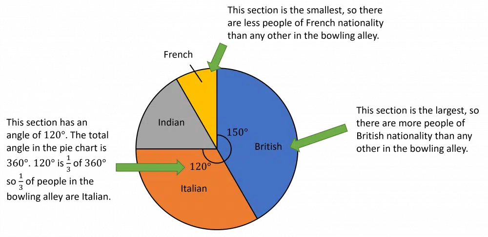
The pie chart below shows the nationalities of people in a bowling alley.
The size of each section shows the proportion of people with that nationality.
Interpreting Pie Charts
Example:
A survey was done asking 90 people how many bathrooms were in their home. Freddie drew a pie chart to display the results of this survey.
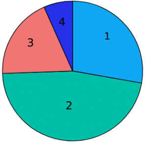
a) What number of bathrooms was most common in this survey?
b) Calculate the number of people who have 1 bathroom in their house.
c) If Freddie picks someone at random from the group surveyed, what is the probability that he chooses a person with exactly 1 bathroom in their home?
a) Clearly, ‘2 bathrooms’ has the biggest slice, so the most common number of bathrooms is 2.
b) To work out how many people had exactly 1 bathroom in their house, we will have to use a protractor to measure the size of the angle in the ‘1 bathroom’ slice. Then convert this to either a fraction, decimal or percentage out of 360 degrees and then multiply by 90 people to see how many people this angle represents.
c) To work out the probability, we need to measure the size of the angle for the 1 slice and then convert this to a fraction by dividing by 360 which will give us the probability.
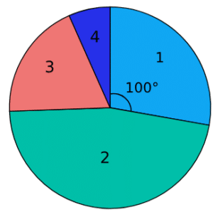
b) We can see that the angle for this sector is 100\degree.
Using the pie chart formula,
\textcolor{#10a6f3}{\text{Things in category}}= \textcolor{#32cd32}{\dfrac{\text{angle}}{360\degree}} \times \textcolor{#10a6f3}{\text{total number of things}}
Subbing in the numbers we get,
Number of people with 1 bathroom =\textcolor{#32cd32}{\dfrac{100}{360}}\times \textcolor{#10a6f3}{90}=\textcolor{#10a6f3}{25}
c) To find the probability of randomly picking someone with 1 bathroom, we just find the proportion of people with 1 bathroom as a fraction of the total. Doing this, we get
probability of picking someone with 1 bathroom =\textcolor{#32cd32}{\dfrac{100}{360}}=\textcolor{#10a6f3}{\dfrac{5}{18}}
Pie Charts Example Questions
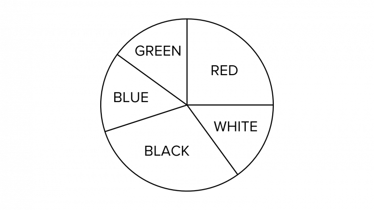
Question 1: The pie chart shows the colours of the jumpers that 32 students wore to school for a non-uniform day. How many students wore a red jumper?
From the pie chart, we can see that the slice representing red jumpers is a right angle which tells us that this slice is exactly one quarter of the circle.
Therefore, one quarter of the class wore a red jumper on this non-uniform day:
32\text{ students}\div4 = 8\text{ students}
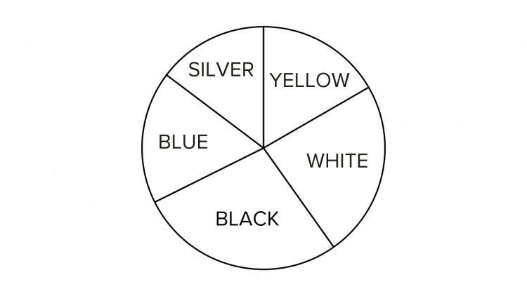
Question 2: The below pie chart shows the colours of cars that passed underneath a bridge during a one-hour period. A total of 510 cars passed beneath the bridge. The number of yellow cars is represented by an angle of 60 degrees. How many yellow cars passed under the bridge?
We know that 510 cars passed underneath the bridge and that the number of yellow cars is represented by a slice of 60 degrees.
We know that in a circle there is a total of 360\degree, thus the proportion of yellow cars can be expressed as the following fraction:
\dfrac{60\degree}{360\degree}
If \frac{60}{360} of the total number of cars were yellow, then the number of yellow cars can be calculated as follows:
\dfrac{60}{360}\times 510\text{ cars} = 85\text{ yellow cars}
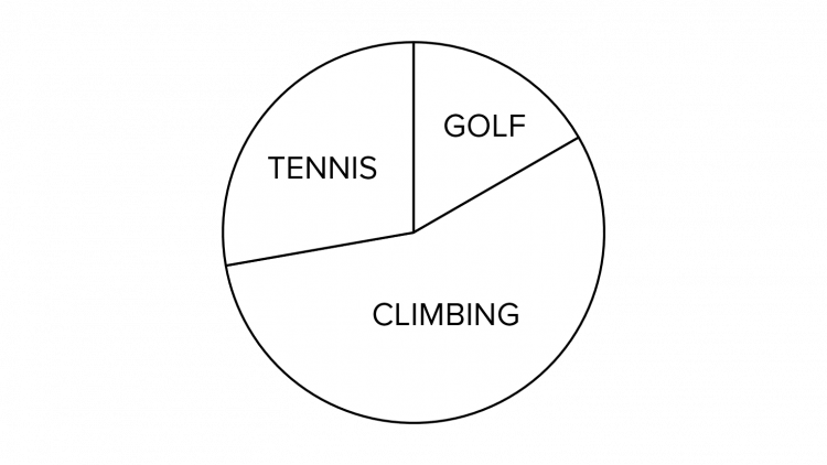
Question 3: Oliver and Lewis spend their leisure time by pursuing various sports such as golf, tennis and climbing. Oliver has 12 hours of leisure time per week, the breakdown of this time is shown in the pie chart below, where the angle of the slice representing golf is 60 degrees.
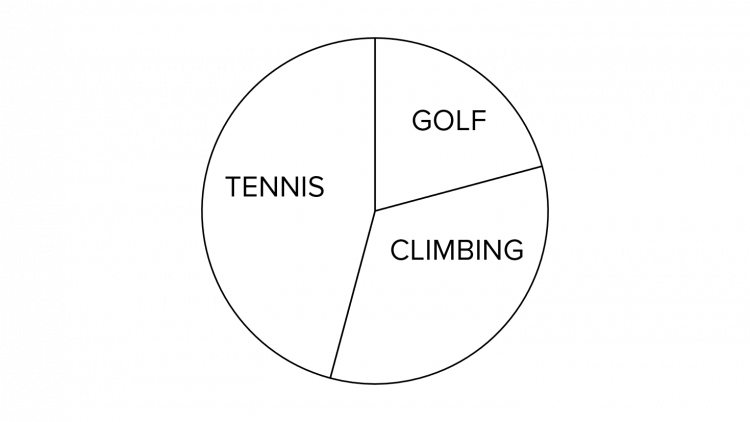
Lewis has 9 hours of leisure time per week, and the breakdown of his leisure pursuits is shown in the below pie chart:
If Lewis spends the same amount of time as Oliver each week playing golf, then how many degrees should the slice representing golf be?
The first thing we need to work out in this question is the amount of time that Oliver spends playing golf.
We are told that he has 12 hours of leisure time in total and that this is represented by a 60\degree slice of the pie chart. Since we know that there are 360\degree in a circle, then the proportion of the time that Oliver spends playing golf can be expressed as follows:
\dfrac{60\degree}{360\degree}
We can therefore calculate the amount of time he playing golf as follows:
\dfrac{60}{360}\times12\text{ hours} = 2 \text{ hours}
If Lewis spends 2 hours of the available 9 playing golf, this will be represented by \frac{2}{9} of the pie chart. Since the pie chart is a full circle (360\degree), then the slice of the pie chart can be calculated as follows:
\dfrac{2}{9} \times 360\degree = 80\degree


